A Phone Viewport Is Not an Android Test
I moved ActivityWatch's hourly chart onto the first phone screen without rewriting saved layouts. The browser evidence is good; Android acceptance is still open.
The ActivityWatch phone layout had a fairly simple problem: you had to scroll past the introduction to get to the interesting part.
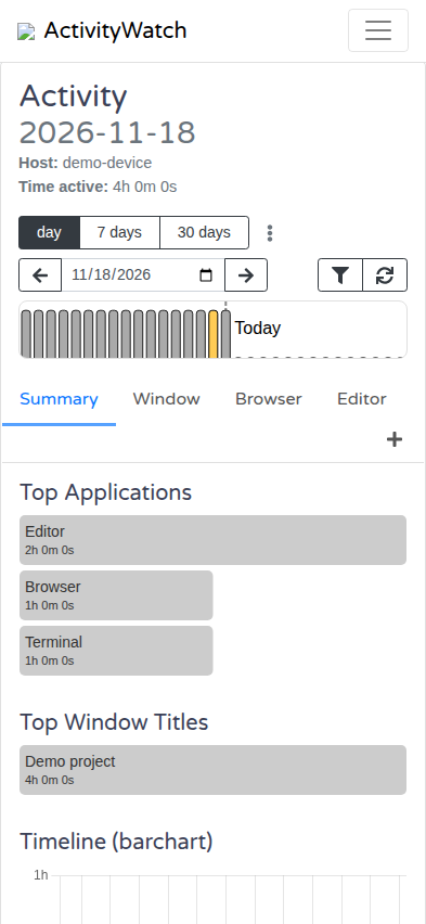
At 393 pixels wide, the Activity heading took two lines. The view tabs and add button took another two. The default summary put its hourly chart after other cards. In an 852-pixel-tall browser viewport, the measured chart canvas ran from y=797 to y=1127, including its title and axis labels. You could see that a chart existed. You couldn’t read the whole thing.
The proposed fix brings the full chart up to y=376–706 in the same populated fixture. It’s still an open PR, not an Android release announcement.
The tempting fix changes somebody else’s settings
ActivityWatch summaries are editable. People can reorder cards, change their sizes and configuration, and create their own views. A default that’s awkward on a phone is not permission to rearrange every saved layout.
I could have migrated the stored default order. That would also change what those people saw on desktop. I could have forced the chart to the top on every narrow screen. That would overwrite the intent of someone who deliberately put another card first.
The patch instead distinguishes an unchanged default from a layout somebody has edited. Below 576 pixels, an unchanged desktop or Android default summary presents the hourly chart first. A renamed, reordered, resized or configured summary keeps its saved order. Entering edit mode also restores the actual order being edited.
The distinction is deliberately conservative: when a configuration no longer matches the supported default shape, it doesn’t get the override.
That makes this a presentation change, not a settings migration. The same saved view can have a better phone default without silently acquiring a new desktop order.
Visual order has to be real order
The first implementation needed another correction during review: moving a card visually is not enough if its place in the document stays behind the other cards.
The current patch reorders a copy of the elements for rendering, without changing the saved array. That keeps DOM order aligned with what the user sees, including keyboard and assistive-technology traversal. A viewport media-query listener updates the presentation when the window crosses the breakpoint.
The other changes are less subtle: a compact heading, horizontally scrolling tab labels, and a separate labelled add-view button that stays available. Long labels shouldn’t push the button onto another row or make it inaccessible to the keyboard.
Here’s the original 393-pixel browser capture:
And the capture after the initial layout fix:
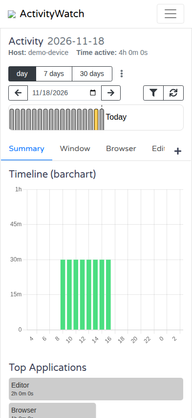
These are browser screenshots using synthetic activity data, not anybody’s time-tracking history. They document the initial layout change; subsequent review fixes align the rendered order with the visual order.
Test the thing that could have broken
A screenshot of an empty dashboard would have been much easier to produce. It would also have avoided the actual problem.
The browser harness intercepts the API with a deterministic populated fixture. The same fixture ran against the clean upstream baseline and the patch. It checks phone widths of 360 and 393 pixels, plus a 1280-pixel desktop layout. The baseline fails the compact-heading assertion; the fixed version passes.
The important checks aren’t just “the chart is higher”:
- Desktop keeps its summary card order. At the tested 1280-pixel width, the measured chart bounds match the baseline. The tab controls change on desktop too; this isn’t a claim that every desktop pixel is unchanged.
- Custom layouts keep their order.
- Edit mode exposes the real order, rather than a responsive rearrangement of the draft.
- Android’s default summary gets the phone presentation too.
- Long German and custom tab labels can scroll, and keyboard activation still opens the add-view control.
There’s a smaller testing mistake worth admitting here. I initially put the optional Playwright smoke script under the existing test/e2e/ directory. TestCafe discovered and imported it, then failed because Playwright wasn’t installed in that test environment. Moving the script to test/visual/ fixed that discovery mistake. An optional test isn’t optional if another runner imports it automatically.
What I still haven’t tested
“Android’s default summary” in that list means the Android layout configuration rendered in desktop Chromium at a phone-sized viewport.
It does not mean the Android app displayed this build successfully.
I tried to inspect the installed app in an emulator, but that release build wasn’t debuggable and exposed no WebView debugging endpoint. I stopped there rather than replace the app and its data just to get a prettier acceptance story.
The browser test establishes useful things: populated layout geometry, responsive behavior, saved-order preservation and keyboard interaction. It doesn’t establish adoption of this web UI build by the Android app, or its behavior inside the actual WebView and native shell.
Those are the remaining steps after merge: verify Android adopts the change, then capture the populated default summary in the real app. Until then, the honest result is a tested web UI fix with an explicit Android acceptance gap.
The screenshots earn the claim that the chart fits in this browser fixture. They don’t earn a claim about a different runtime.